Beautifully Designed
Survey Dashboards
& Presentations
The Simple and quick solution for custom survey dashboards, interactive presentations and amazing reports
The only DIY tool that gives market researchers same day Tableau survey dashboards with no experience required


Better insights through ad hoc exploration and interactivity
Using Tableau, the market leader in data visualization, you will be able to generate insights visually by filtering, segmentation, interacting, drilling down and exploring like the pros.

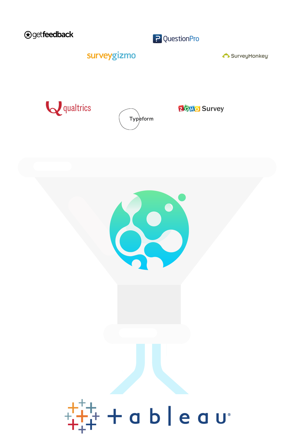
Save time, money and tears with our automated survey to Tableau methodology
No need to recreate the wheel and spend months researching and learning different techniques and tool just to create subpar dashboards. Skip the uncertainty and start analyzing your results instantly using our industry-leading dashboards without the hassle.
Innovative reporting with our Prebuilt Interactive Dashboards, Reports & Presentations
Amazing prebuilt survey dashboards and reports built by Tableau experts. Don't waste time recreating reports, use our reusable custom templates without having to learn Tableau.

A streamlined DIY process for a quick turnaround with no headaches
A step by step process that has been proven to reduce headaches and mistakes. We went through all the pain for you and created an automated solution that solves all those survey data problems you hate so you don't have to.

Unlimited possibilities and customization utilizing the full power of Tableau
Integrate third-party data, create interactive presentations, provide a self-service interactive report and dashboard, with the full power of Tableau anything is possible.

No more frustrating manual work and feeling out of your depth
We all hate having to copy and paste, taking screenshots, and dealing with the error prone Excel worksheet. Go back to spending your time finding insights and let us deal with the data cleaning and visualizations.

Jeff Galak
Professor, Carnegie Mellon University
I worked with VizualSurvey to create an interactive visualization of a large-scale survey looking at the climate within academic marketing. VizualSurvey was incredibly responsive to all the idiosyncrasies of my requests, responded in a timely manner, and delivered a very high quality and powerful visualization. I would gladly recommend them to anyone looking for help with visualizing complex survey data!

Kim Boyd
Strategic Insight Leader, Trane Commercial
The end result is an awesome and dynamic Tableau presentation. Our expectations have been exceeded!
Wow your clients with a fresh new look in 3 simple steps
Streamline the entire survey data to Tableau process and get amazing dashboards and presentations in a fraction of the time

1. Use our innovative survey data cleaning tool to transform your data effortlessly
Our self service tool was specifically built to deal with messy survey data and put it in the optimal format for Tableau and our prebuilt dashboards.

2. Uncover hidden insights using our Interactive Tableau dashboards
Analyze, filter, and segment your survey data using a custom branded interactive Tableau dashboard that you can share with anyone.
3. Tell a Story with an interactive presentation and beautifully designed report
Create an amazing report and presentation quickly in Tableau by clicking and dragging. Deliver or present an interactive report for a huge wow factor.

WoW your audience with a stunning survey dashboard and presentation
Answer questions quickly with a dynamic interactive dashboard. Start visualizing and presenting your survey data like never before!
VizualSurvey + United Against Slavery
How United Against Slavery used VizualSurvey to generate complex survey reports in days compared to months.
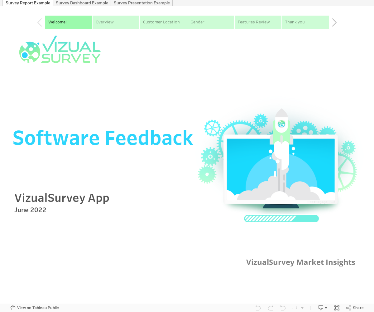
Try it Yourself! Interact with the Sample Report, Dashboard & Presentation
Click on the green boxes to change the slides in the report, then switch to the dashboard or presentation by clicking on the tab
Are you ready to start using
amazing survey dashboards?
See VizualSurvey in action with our free demo, stop using boring Excel charts and PPT’s, upgrade your survey analytics today!