Preparing and Cleaning Survey Data for Tableau | Best Practice
Cleaning Survey Data
In this post, we will discuss the steps to clean survey data or survey results from any survey software so you can analyze them in any BI or data visualization tool. Cleaning survey data is an essential step before visualizing survey data in any data visualization tools such as Tableau, PowerBI, Qlik Sense or Spotfire.
I’m Tyler Lubben, founder of VizualSurvey, a survey dashboard and presentation consulting company where we can collect your survey data from any survey software so you can visualize it in any of our Tableau, Power BI, Spotfire or Qlik Sense dashboards. This article will show you some of the main problems you have when you’re trying to visualize or analyze survey data from any of the popular survey tools such as Google Forms, Qualtrics, QuestionPro, SurveyMonkey, SurveyGizmo…. as well as how you can solve these problems by cleaning survey results in excel and making dashboards in a data visualization tool.
Survey Data Problems
The purpose of getting survey data is to get accurate insights. To achieve this, we need to be able to visualize survey data accurately. Most of the survey tools have their own reporting tool, and you can see basic analytics of your survey if you sign up for the highest-paid plan. To do a deep analysis like combining multiple surveys from different times or from different survey software and visualizing it in one dashboard, you need Tableau, Power BI or another data visualization tool. You will get many options like filtering, cross-analysis of different questions, and other extensive features only possible through a custom data visualization tool. It sounds good but it is hard to do, you can’t just download a CSV file, and connect your data to any data visualization tool. You will need to clean your survey data first, learn how to use a data visualization tool, then create a dashboard for that specific dataset. So when you export a CSV file from a survey data tool, you have a lot of problems, and some of the most important ones are discussed below.
1. Each Survey Software Outputs Data Slightly Different
Each survey software is different from their question type structure to how they export the data. They organize responses in their own way, so when you download your survey results from one survey software more than likely it will be a totally different structure from another survey software.
Google Forms:
If we look at the exported CSV file from Google Forms, we will see it doesn’t contain respondent IDs, which is needed to count distinct respondents.
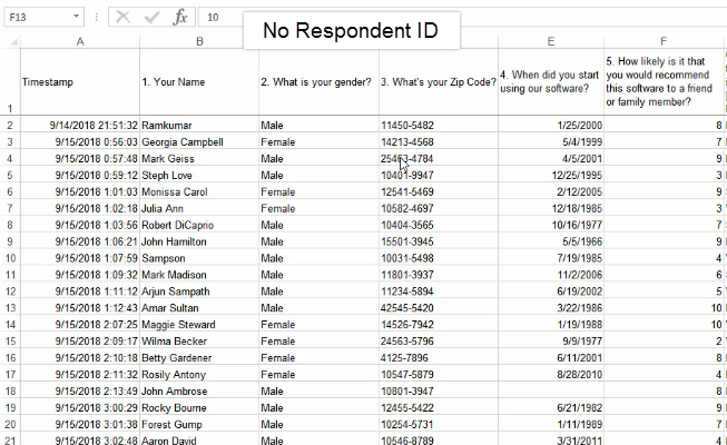
In the case of multiple choice questions where people can choose more than one answer, all answers are in one column just separated by a comma (,). This causes a problem when you try to visualize survey data in any data visualization tool. Another common question type (matrix questions) in Google Forms, is structured with the question and what was in the rows in the header and the text that was in the columns in the cell.
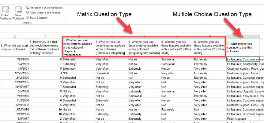
Figure: Google Forms Questions
SurveyMonkey:
If you export a survey response file from SurveyMonkey, you will see a double header in the CSV file, which is not ideal for a data visualization tool. For multiple choice question types, you will see different columns for different answers which is different compared to Google Forms.
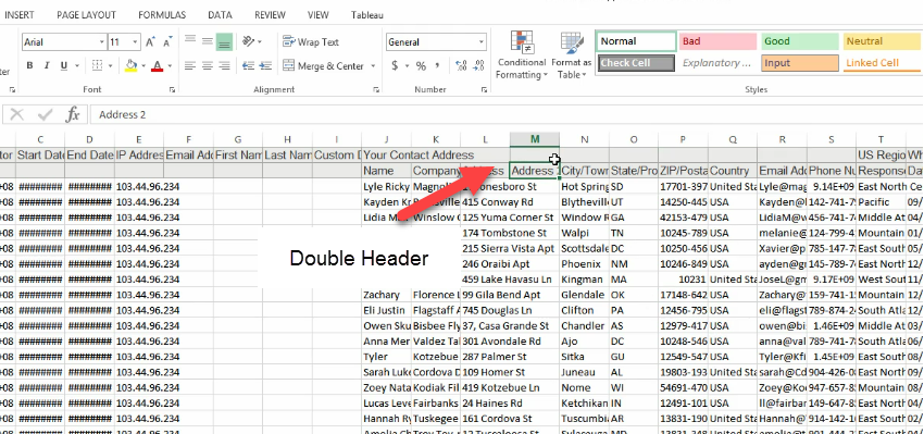
Figure: Double Header in SurveyMonkey CSV File.
Other Survey Tools:
You will also find the same problem in other survey tools like in Getfeedback; you will see double header like SurveyMonkey. In QuestionPro, you will get questions in the 3rd row and multiple unnecessary columns that you need to fix manually before visualization.
So survey responses are structured in different ways in different survey tools, which is not perfect for data visualization. But once you start using a single survey tool, the process becomes more comfortable for you when visualizing the survey results in a data visualization tool.
2. Different Structure Depending on Question Type
Depending on the question type, the structure of the output is going to be different in the rows and columns. Let’s go back to Google Forms CSV file to see what I mean.
Single Response Question:
Let’s look at our single response question (what is your gender?) where people can choose only one answer (male/female), and you will see the answer is in one column.
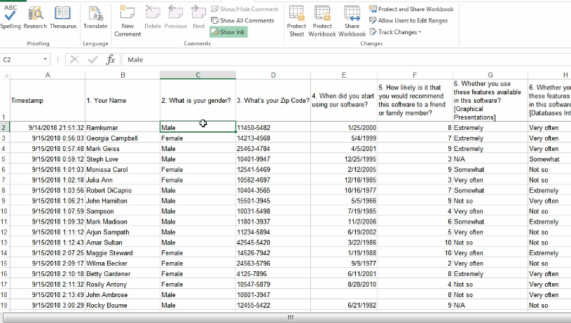
Figure: Single Response Question in Google Forms
Numeric Question Type:
For numeric question type on Google Forms (How likely is it that you would recommend this software to a friend or family?), you get a numeric value (1 to 10) instead of text in a single column.
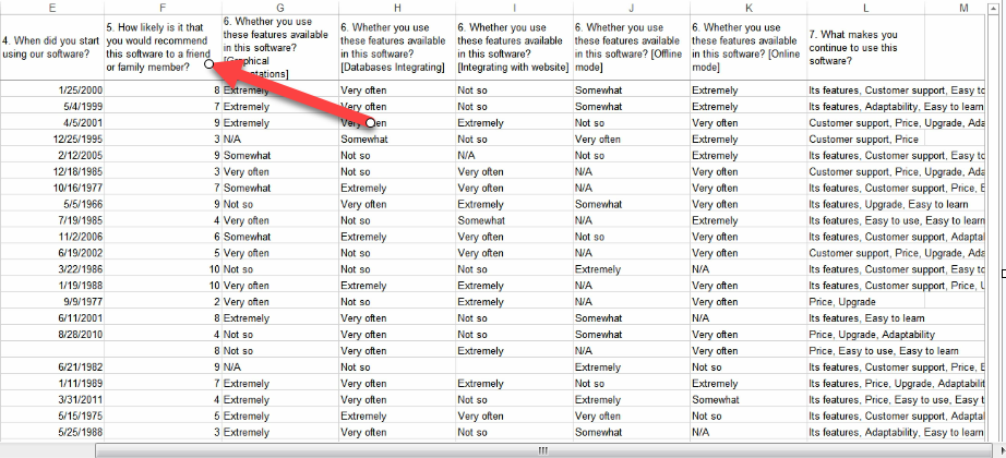
Figure: Numeric Question Type in Google Forms
Matrix Question Type:
For the matrix question type on Google Forms, you get multiple columns for each row in that matrix. “Whether you use these features available in this software?” Also, you will see rows of that question like graphical presentation, offline mode, online mode, etc. are attached in the column name like “Whether you use these features available in this software?[Online mode]”.
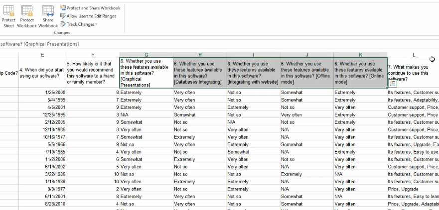
Figure: Matrix Question Type in Google Forms
Multiple Choice Question Type:
In the multiple-choice question type, we get one column containing many answers separated by a delimiter comma (,).
So we can see that the structure of the rows and columns for a question is different depending on what the question type is. This gives us another problem that we need to solve to analyze survey data in excel or any data visualization tool.
Figure: Multiple Choice Question Type Google Forms
We can see here that the structure of the rows and columns for a question is different depending on what the question type is. This gives us another problem that we need to solve to analyze survey data in excel or any data visualization tool.
3. The Structure of the Output is Not Optimal
Another thing is the overall output of survey data from the survey tools is not optimal for putting that data into a BI tool or data visualization tool. Survey data needs to be pivoted into three core columns resp id, questions, and answers to make it ready for visualization. Once the data is pivoted we will add additional columns outside of the original 3 core columns to make things a lot easier. I call this a crosswalk or helper file.
Software’s to Solve Survey Data Problems
I’m going to teach the best method to clean survey data while doing it manually in Excel. Doing it in Excel is very tedious compared to using a tool designed to walk you through the process, as well as automating it. There are some tools outside of Excel which can make your life easier, which I have listed below.
1. VizualSurvey
VizualSurvey does all of this for you using our innovative survey data cleaning tools so your can start visualizing survey data in a dashboard quickly without having to create or learn a data visualization tool. Our VizualSurvey tool works in simple 3 steps
- Send us your survey data or let us program it: Send us your survey data from any survey software or let us program the survey for you using our survey software or another survey tool of your choice.
- We clean and transform your survey data using of exclusive data cleaning tools: Our survey software allows us to provide you a beautiful survey dashboard and presentation quickly so you don’t have to wait months.
- Start visualizing your survey data in a custom dashboard and presentation: We create an interactive survey dashboard and/or presentation so you can start visualizing your survey results instantly.
If you want to make things even easier you can use VizualSurvey Online to create and program your surveys, so you can skip the data cleaning process entirely.
2. Tableau Prep
Tableau Prep is a general data cleaning tool that you can use like Excel to clean any data but you will have to learn the best technique for cleaning survey data and program it yourself.
3. Alteryx
Alteryx is another tool used for handling large datasets. Using multiple functions, you can make your data ready for graphical representations. Again you need to know how to use it, and the methods to clean survey data since it’s a general data cleaning tool.
4. Excel
Everyone knows Excel but the process of cleaning survey data using Excel is very hard and manual, which I will show you now as it’s available to everyone compared to other tools. Excel is good for storing data, but it’s not a data visualization tool. Unfortunately, many people try to analyze data using graphs and charts using Excel.
Best Method to Clean Survey Data
So far, we have discussed the main problems people run into with survey data; now we will see what the best practices are when it comes to cleaning survey data. We are going to go through the entire data cleaning and data prep process for a Google Forms survey that we conducted. This article will reveal what methods we used and why we did it.
1. Export Survey Data
As Google Forms is free, you can download or export survey data in a CSV file. Some software such as SurveyMonkey, you need a paid plan to export survey responses. However, we will only discuss Google Forms survey responses to make the process easier for you.
2. Delete Columns That are Not Needed
If we look at our Google Forms survey CSV file, we can see the first column is Timestamp, which is generated by Google Forms. So as the “Timestamp” column is an extra column we will not use we can delete this column and any other questions or columns you don’t want to analyze. We want to keep only the questions we care about or else it is extra work for no reason.
3. Add Respondent ID If Not Present
Another thing is we have no respondent id column here. Most survey software does, Google Forms don’t for some reason. So let’s add a column for the respondent id. It just has to be a distinct id of some sort so that we can count distinct IDs. Here I am putting a distinct row id for each row.
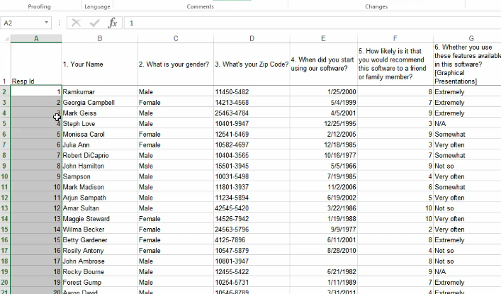
Figure: Respondent Id Column Added
4. Split Multiple Choice Column if Needed
Now for multiple choice questions in Google Forms, you can see all the answers are in a single column separated by a delimiter. We need to split them out in order to count each of these answers for each respondent. To do this, Let’s follow this process.
- Highlight the multiple-choice column.
- Click on “Data” and then go to (text to columns). A pop up box will open.
- In the box, put a check on delimited and click next.
- Select comma and click finish.
So now, we have separate columns for each answer with no header on the new ones so we need to copy the header text into all the new empty column headers.
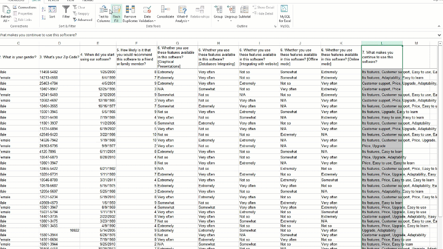
Figure: Splitting Column for Each Answer
5. Copy Columns into a New Tab and Create a Crosswalk
Now, I’m going to make a new worksheet and copy all the headers going across except respondent ID and paste (transpose paste) it in the new worksheet. Create an extra row for the header and name it Questions.
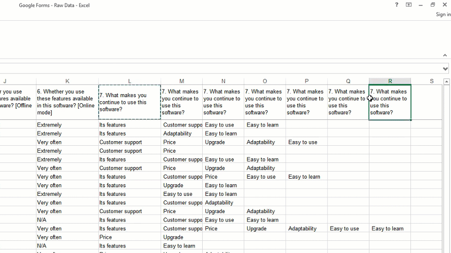
Figure: Creating a Crosswalk Worksheet.
Now let’s add a few additional columns called “question number”, “final question text”, “question type”, and “matrix row”. Now, if you see the questions from Google Forms, you will see the question number is associated with them. For some question types, for example, the matrix and multiple choice question type has multiple column headers associated with just one question number. This means these are not a separate question, so we have to group them together. In the question number column give a single number to a single question this will group the same question columns together by giving them the same question number.
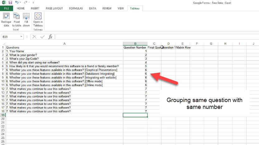
Figure: Grouping the Same Question
Next is the final question text column, most of the time what is in the header field is not what the end user saw. This is where you will clean up the text that the end user will see as the question. The main thing is for every question number you will have the same exact final question text, so for the matrix question all the columns associated with that question number will have the same final question text.
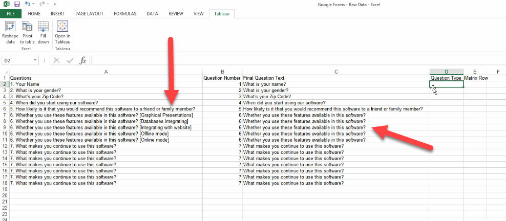
Figure: Final Question Text
The last one is the matrix row, which helps us with the matrix question types when trying to visualization that question type. Here we will put the values that was in the rows of matrix question and paste it in this column. You will find the values that was shown on the rows at the end of the original question column, this is sometimes different depending on your survey software.
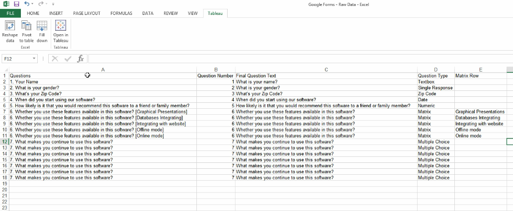
Figure: Question Type and Matrix Row Column
The good thing about this crosswalk is we only have to do this once, so at this point we are all done and its time to move to the next step.
6. Add Tableau Extension
Now download the Tableau Excel extension and install it in your PC so you can use Tableau 7.0 Excel Add-in in your excel sheet. That’s going to be used to reshape the data for us.
7. Reshape data
Ok, now let’s go back to the original dataset. Now using the Tableau add-in, we will reshape the data. Follow this process.
- Click on the B2 cell, which is the first answer to the first question.
- Click on Tableau add on and click reshape data.
- A dialog box will pop up. Just click, ok.
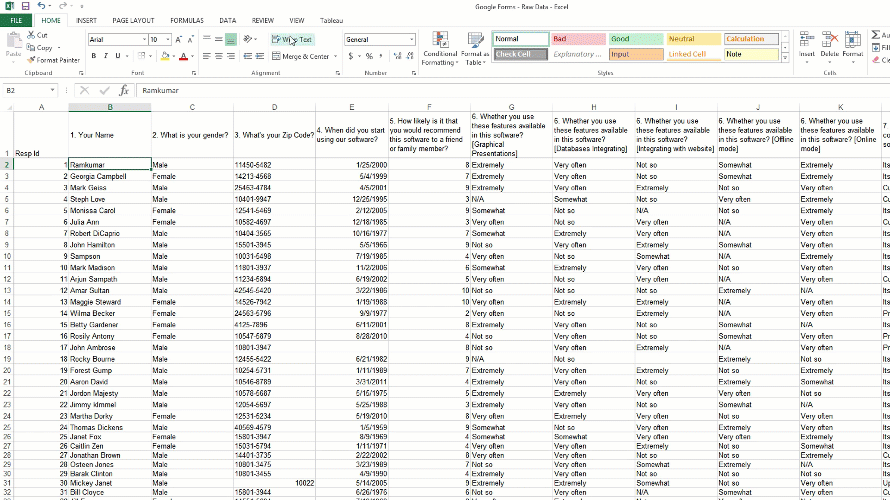
Figure: Reshape Data
The data will then be pivoted into 3 columns into a new worksheet. The first column is for respondent id, the second column header is questions and the third column header is answers. These are the three core columns that we need.
8. Do a VLOOKUP to bring in the Helper Columns
Now we are going to do a simple VLOOKUP Excel function to lookup and bring in the data from the crosswalk tab we created. Ok, let’s look at VLOOKUP Syntax first.
- VLOOKUP Syntax = VLOOKUP(lookup_value, table_array, col_index_num, [range_lookup])
- lookup_value = This is the value to search for (value/cell reference).
- table_array = This is the table from which to retrieve a value.
- col_index_num = This is the column in the table from which to retrieve a value.
- range_lookup = Approximate match (default). FALSE = exact match.
- Now to do VLOOKUP, let’s follow the process.
Step 1: First copy and paste additional column headers from “Crosswalk” worksheet to the original worksheet. Select the B2 cell and make it absolute $B2 for just the column to look for questions.
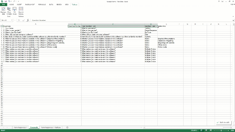
Figure: Cleaning Survey Data Using VLOOKUP
Step 2: Now go to “Crosswalk” worksheet, and select from A2 to E18 for table_array, and absolute the entire thing. Now we have to select a column from which to retrieve the data. The counting starts from the leftmost column in the table array, which is 1. So we type 2 to get a matching value from column B. For range_lookup we will type false as we want an exact match.
So it will be =VLOOKUP($B2,Crosswalk!$A$2:$E$18,2,false)
Press enter key to complete formula, and you will see 1 in D2 cell. on the original worksheet which is under “Question Number” column.
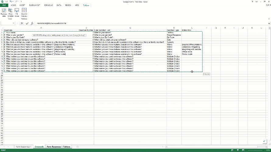
Figure: Cleaning Survey Data Using VLOOKUP
Step 3: Now copy the same formula to other columns to the right of it. We just have to change “col_index_num” to get values for these columns.
For “Final Question Text” column it will be: VLOOKUP($B2,Crosswalk!$A$2:$E$18,3,false). As we typed 3, it will get value from column C of “Crosswalk” worksheet.
For “Question Type” column it will be: VLOOKUP($B2,Crosswalk!$A$2:$E$18,4,false). As we typed 4, it will get value from column D of “Crosswalk” worksheet.
For “Matrix Row” column it will be: VLOOKUP($B2,Crosswalk!$A$2:$E$18,5,false) For this column, if it finds value in column E, it will bring it in. Otherwise, it will show 0, which is ok.
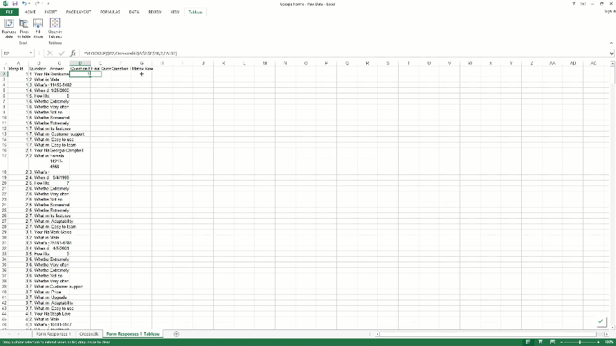
Figure: Cleaning Survey Data Using VLOOKUP
The Basic on How to Visualize Survey Data
So this is the basic process and method to clean survey data, of course it can get a lot more complicated then this. In this part of the blog, we will see how you can visualize the new survey dateset in Tableau. You can download Tableau Public for free if you have not yet but I am just going to give you an overview of what to do once you get your data cleaned.
1. Count Distinct Respondent Id’s
Connect your data to Tableau, and you can see all the column names on the left side. First, we need to create a new field called respondents, which is a distinct count of respondent ID.
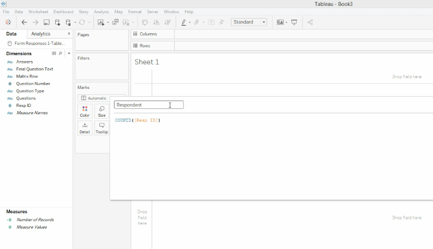
Figure: Creating Distinct Respondent Id
2. Add a Question Number or Final Question Text Filter
Now let’s go ahead and throw out Question Number, Question Type, Final Question Text and Answers in the rows, and drag “Respondent” from measures to the ABC column. Click on the question number and select show filter from the sub menu.
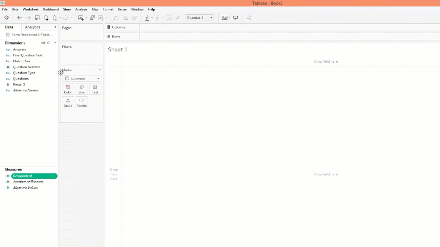
Figure: Excel to Tableau Reporting
3. Separate Charts by Question Type
We will make a new sheet for each question type. So for the text box question type, we will create a new sheet that contains all the questions that have the same question type in this case text box. For zip code, we will do a map chart, and for a single response, we can create a bar chart. For the date, we can create a line chart or area chart. For numeric question type, we can show the median, average, etc. The main point here is each question type will have its own sheet/chart which is fine since the data is structured the same for a question type, then you can just flip through each of the questions associated with that question type in a single chart.
4. For matrix Question Type
For the matrix question, we have to do some additional work. Here you need to drag the answer field in columns and matrix row in row. See the picture below.
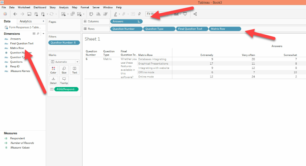
Figure: Matrix Row Question in Tableau
Here we have completed a basic survey data cleaning in excel and to give you an idea of how you can prepare survey results or responses for a data visualization tool. Again most of the time, your survey data will be more complicated than this with many question types, and you may need to connect multiple excel sheets in Tableau. The process will be very difficult for you if you are not a data visualization expert or familiar with these methods. It’s also time-consuming. That’s why VizualSurvey was created to speed up the process and do all the hard work for you. If you are interested in trying it out just send us a message.. See you next time!
The simple and quick solution for amazing survey dashboards & Interactive Presentations